


Connecting a new solar photovoltaic (PV) system to the grid can be a slow and uncertain process. For years, installers and property owners have faced lengthy waits for utility approval, often with little transparency into the reasons for delays. A data-driven approach is changing this. Hosting capacity maps offer a clear, upfront view of the grid's ability to accommodate new solar energy, streamlining the entire approval timeline.
What is Grid Hosting Capacity?
Understanding hosting capacity is the first step to appreciating its impact on PV approvals. It is a technical measure that defines how much new power generation can be added to the electrical grid without compromising safety or reliability.
Defining the Concept
Think of the grid as a network of roads and a new solar installation as a car entering a highway. Hosting capacity tells you how many more cars can enter that specific highway entrance before causing a traffic jam. For the electric grid, these 'traffic jams' are technical issues like voltage fluctuations, thermal overloads on wires and transformers, or interference with safety equipment. Exceeding the hosting capacity can lead to power quality problems or even outages for you and your neighbors.
The Traditional Approval Bottleneck
Historically, determining if a new PV system would cause problems required a manual, case-by-case engineering study. An installer would submit an application, and a utility engineer would then spend significant time analyzing the specific circuit. This process is often slow, opaque, and expensive. It creates a bottleneck that delays projects for weeks or months, adding uncertainty and cost for everyone involved. This outdated method struggles to keep pace with the rapid growth of solar energy.
How Hosting Capacity Maps Revolutionize PV Approvals
Hosting capacity maps replace the slow, manual study with an automated, transparent system. They provide an immediate assessment of the grid, empowering both utilities and solar applicants with actionable data.
Visualizing Grid Readiness
These maps function like a traffic light system for the grid. They use a simple color-coded overlay on a geographic map to display hosting capacity levels for different areas:
- Green Zones: These areas have plenty of capacity. Connecting a new PV system here is likely to be straightforward, often qualifying for a fast-tracked approval process.
- Yellow Zones: These areas are approaching their limit. A new connection might be possible but could require a more detailed review or minor, low-cost grid adjustments.
- Red Zones: These circuits have little to no remaining capacity. Connecting here would likely require significant and expensive grid upgrades, making projects in these areas less feasible.
This visual information allows installers to pre-screen sites and guide customers toward locations where interconnection will be fastest and most affordable.
The Data-Driven Engine
The maps are powered by sophisticated software that runs thousands of simulations. This software analyzes vast amounts of data, including detailed circuit models, existing solar generation, and local power consumption patterns. The goal is to create a reliable technical assessment of grid connection capacity. According to the IEA's System Integration of Renewables report, such transparent assessments are fundamental for integrating renewables effectively. Advanced platforms can process this information with incredible speed. For instance, projects supported by the U.S. Department of Energy have shown that automated analysis can shrink a 55-day study process down to just one hour.
The Practical Benefits for Installers and Homeowners
The shift to hosting capacity analysis delivers tangible advantages, making solar more accessible and cost-effective. It moves the industry away from guesswork and toward data-backed decisions.
Accelerating Project Timelines
With instant access to grid data, solar developers no longer have to submit an application and wait to discover a problem. They can identify viable project sites from the start. This proactive approach avoids delays and streamlines project pipelines. For example, after implementing a similar data platform, Pacific Gas & Electric (PG&E) was able to connect 6,000 new solar customers each month with an average approval time of just three days.
Reducing Interconnection Costs
By steering projects toward green zones, developers can avoid the need for expensive, in-depth engineering studies. More importantly, they can avoid locations that would trigger the need for costly physical upgrades like new transformers or larger conductors. The International Energy Agency highlights in its manual, Getting Wind and Solar onto the Grid, that managing grid costs is a primary concern in renewable deployment. Hosting capacity maps directly address this by optimizing the use of existing infrastructure.
Enhancing System Performance with Smart Choices
Choosing a site with ample hosting capacity ensures your solar system can export its full power to the grid without being curtailed (intentionally reduced) by the utility. This maximizes your return on investment. Matching your system components to both your energy needs and the grid's capabilities is also critical. For detailed benchmarks on how different components, such as inverters and batteries, influence overall output, you can review this ultimate reference on solar and storage performance to make informed decisions.
The Future of Grid Interconnection
Hosting capacity analysis is not a static technology. It continues to evolve, promising even greater efficiency and enabling a more flexible, resilient grid powered by distributed resources.
From Static Maps to Dynamic Tools
The next frontier is dynamic hosting capacity. Instead of maps updated monthly or quarterly, utilities are moving toward tools that can analyze grid conditions in near real-time. This incorporates factors like current weather and actual demand. Technologies such as Dynamic Line Rating (DLR), which monitors the real-time temperature of power lines, can safely unlock up to 60% more capacity from existing wires, further expanding opportunities for solar integration.
Integrating Energy Storage
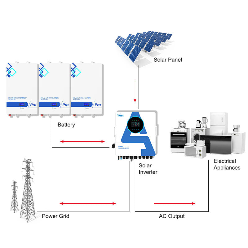
Energy storage systems (ESS), particularly lithium-ion batteries, are game-changers for hosting capacity. A battery can store excess solar energy generated during the day and either use it later or feed it back to the grid during peak demand. This ability to absorb and shift power helps stabilize the local circuit, effectively increasing its hosting capacity. As noted in the IEA's Harnessing Variable Renewables report, flexible resources like battery storage are crucial for managing a grid with high levels of renewable energy. This makes PV-plus-storage systems an increasingly attractive option, especially in areas with moderate grid capacity.
| Feature | Traditional Interconnection Process | Hosting Capacity Map-Based Process |
|---|---|---|
| Initial Screening | Manual review by utility engineer | Automated, instant check by applicant |
| Study Time | Weeks to months | Minutes to hours |
| Cost | High (due to engineering hours) | Low (automated, self-service) |
| Transparency | Low (black box for applicant) | High (clear visual data) |
| Project Certainty | Low until study is complete | High, early in the process |
Disclaimer: This information is for educational purposes only and does not constitute financial or investment advice. Consult with a qualified professional before making any decisions regarding solar installations.
Final Thoughts on Streamlining Solar Deployment
Hosting capacity maps represent a critical shift in how we manage our energy infrastructure. They transform the grid connection process from a slow, opaque barrier into a fast, transparent enabler of clean energy. By providing clear, data-driven insights, these tools accelerate PV approvals, reduce project costs, and support more intelligent grid planning. This technology is essential for building the flexible, decentralized, and renewable-powered grid of the future.
Frequently Asked Questions
Who provides hosting capacity maps?
Typically, electric utility companies develop and publish these maps for their service territories. They are often made available to the public, solar installers, and developers through online portals.
Are hosting capacity maps 100% accurate?
Hosting capacity maps provide a highly reliable initial screening tool based on extensive grid modeling. However, they are a snapshot in time and may not account for all real-time conditions or recently approved projects. Most utilities use them as a 'green-light' for simplified interconnection, but a final, expedited review may still be necessary.
What if my desired location is in a red (low capacity) zone?
A red zone indicates that connecting a new solar system will likely require significant and costly grid upgrades. While connection might still be possible, you should expect a longer, more complex, and more expensive interconnection process. It is often more practical to explore alternative locations or consider a smaller system size. Adding a battery storage system can sometimes help mitigate grid impact and improve the feasibility.
Do these maps apply to both residential and commercial solar projects?
Yes, the data and principles behind hosting capacity maps apply to all scales of distributed generation, from small residential rooftop systems to large commercial installations. The primary difference is that larger systems have a greater impact on the grid, so the thresholds for what constitutes a 'green' or 'red' zone will be different.
